Wall Art Size Guide: Create Balanced Printed Art for Every Room
A beautiful print can still feel wrong if it is too small for the wall around it. This wall art size guide takes the guesswork out of choosing proportion, so your canvas prints, posters and decorative pieces feel considered rather than simply placed.
The aim is not to cover every inch of wall space. It is to create visual balance: enough scale to give the room a focal point, enough breathing room to keep the look calm, and a size that relates naturally to the furniture below it.
Start with the furniture, not the empty wall
When art hangs above a sofa, bed, sideboard or desk, that piece of furniture is your best sizing reference. A reliable rule is to choose artwork, or an arrangement of artworks, that spans around two-thirds to three-quarters of the furniture’s width.
For example, a 210 cm sofa looks most at home with wall art measuring roughly 140 to 160 cm wide in total. That could be one oversized canvas, a pair of complementary prints, or a composed gallery arrangement. A 50 cm print in the middle of that same sofa may be lovely on its own, but it will visually disappear once the room is furnished.
This proportion is a guide, not a rigid formula. A low, wide sideboard can support a broader artwork, while a tall upholstered headboard may call for a slightly narrower composition. What matters is that the art and furniture read as one intentional zone.
Wall art size guide by room
Living room
The living room is often where scale has the biggest impact. Above the sofa, larger is usually better. A single statement canvas gives a contemporary room a clean, confident focal point, particularly when the artwork has bold abstract shapes, organic texture or a strong colour story.
For a standard three-seat sofa, look towards one large piece around 100 x 150 cm, depending on the sofa’s width and the shape of the wall. Two pieces at 60 x 90 cm can create a balanced diptych, while three smaller works are effective when you want rhythm without the formality of one large rectangle.
Leave around 15 to 25 cm between the sofa and the bottom of the frame. If the artwork is much higher, the connection between furniture and wall starts to break. On an otherwise empty wall, give a hero piece room to breathe rather than surrounding it with extra décor just to fill space.
Bedroom
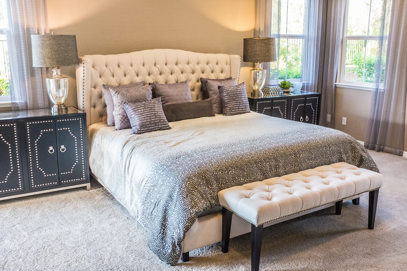
Above a bed, art should feel restful as well as well-proportioned. A landscape-oriented print is a natural choice above a headboard because it echoes the width of the bed. Aim for artwork that is roughly half to three-quarters of the bed’s width, measured from the outside edges rather than the mattress.
Above a double bed, a canvas around 90 x 120 cm or 100 x 150 cm often feels substantial without taking over. A pair of vertical prints can also frame the centreline neatly. Keep the bottom edge approximately 15 to 20 cm above the headboard, or slightly higher if you have a tall, upholstered design.
For a bedroom with no headboard, treat the bed and bedside tables as the full visual width. Art that is too narrow can make the wall feel oddly top-heavy, whereas a wider piece brings a softer, more finished sense of proportion.
Dining room
Dining spaces suit art with presence. A large canvas above a sideboard can anchor the room and make everyday meals feel a little more considered. Use the same two-thirds to three-quarters rule, based on the width of the sideboard.
If the wall is beside the dining table rather than above furniture, consider the table’s length and the viewing distance. A narrow dining room may benefit from one horizontal piece that draws the eye along the space. In a larger room, an oversized modern print can hold its own against a long table, pendant lighting and dining chairs.
Hallway and entryway
Hallways are ideal for adding personality, but their narrower proportions demand a little restraint. Choose vertical artwork on short walls or at the end of a corridor to create height. On a long, uninterrupted wall, a run of smaller frames can turn a pass-through into a gallery-like moment.
Avoid artworks that project too far from the wall in a tight hall. Slim framed posters and flatter canvas prints keep the route feeling open. If you are styling an entryway above a console table, use the furniture-width rule and hang the art low enough to feel connected to the surface.
Home office
Art above a desk has a quieter job: it should add character without making the work area feel crowded. One medium-sized print, typically around 50 x 70 cm or 60 x 90 cm, is often enough for a compact workspace. A wider desk can handle a larger horizontal canvas or two related pieces.
Choose artwork that supports the atmosphere you want to work in. Soft neutrals and calming abstracts feel composed, while colour-block designs or graphic posters can bring energy to a creative corner.
How high should wall art hang?
A useful starting point is to hang the centre of an artwork at around 145 cm from the floor. This places the piece close to average eye level and works well on a blank wall. In homes with particularly high ceilings, resist the temptation to push art upwards. Empty space above a frame can be elegant; art floating too close to the ceiling rarely is.
Above furniture, the gap below the artwork matters more than the centre measurement. Keep most pieces 15 to 25 cm above a sofa, bed, bench or sideboard. For a collection of frames, treat the whole arrangement as one artwork and measure from its overall centre.
Before making holes, use masking tape or sheets of paper cut to the size of your chosen piece. Step back, sit on the sofa, walk into the room and view the placement from the doorway. This quick test reveals whether the artwork needs more scale, a lower position or a different orientation.
Choosing one large piece or a gallery wall
A single large canvas is often the simplest answer to a broad blank wall. It creates an immediate focal point, makes a room feel more resolved and lets the artwork’s colour and texture do the work. This approach is especially effective in modern interiors where clean lines and fewer, stronger elements set the tone.
A gallery wall offers more flexibility. It can bring together abstract art, graphic posters and personal visual references, making it a good fit for staircases, hallways and spaces that need a more expressive layer. The trade-off is that it needs planning. Keep the gaps between frames consistent, usually around 5 to 8 cm, and map out the arrangement on the floor first.
For a polished gallery wall, choose one unifying element: a shared palette, matching frame finishes, a repeated print size or a similar art style. Variety creates interest, but too many unrelated visual directions can make the result feel busy rather than curated.
Scale for tall ceilings and awkward walls
Tall ceilings can make standard-sized art look undersized. Instead of hanging one small frame high on the wall, use larger vertical artwork, a stacked pair of prints or a salon-style grouping that occupies more of the wall’s central area. You do not need to fill the full height, but the composition should have enough presence to relate to the architecture.
For narrow wall sections between windows, doors or built-in shelving, work with the shape rather than against it. A vertical poster can turn an overlooked strip into a deliberate detail. On a small wall, one carefully chosen medium piece is usually stronger than several tiny frames competing for attention.
Renting does not change the principles of scale. It may influence how you hang your art, but a substantial print can still transform a flat more effectively than several undersized pieces. Consider lightweight canvas options or appropriate damage-free hanging methods where suitable for the wall and artwork.
Let the artwork set the mood
Size is only one part of the decision. The right artwork also picks up the room’s colour, mood and level of contrast. A large neutral canvas can bring softness to a busy living room, while a vivid contemporary print can give a pared-back bedroom the lift it needs.
If you are unsure between two sizes, choose the one that gives the room a clearer focal point. Well-scaled wall art does more than fill a gap: it makes the furniture, colours and personality already in the room feel like they belong together.