
How to Choose Wall Art That Makes a Room Feel Finished
A blank wall can make even a beautifully furnished room feel unfinished. The right artwork changes that instantly: it gives the eye somewhere to land, brings separate pieces together and makes a space feel like it belongs to you. Learning how to choose wall art is less about following rigid design rules and more about noticing what your room is already asking for.
Start with the feeling you want to create. A large abstract canvas can make a living room feel confident and composed; a soft landscape can bring calm to a bedroom; graphic posters can add energy to an office or hallway. Once you see wall art as part of the room rather than an afterthought, choosing it becomes much easier.
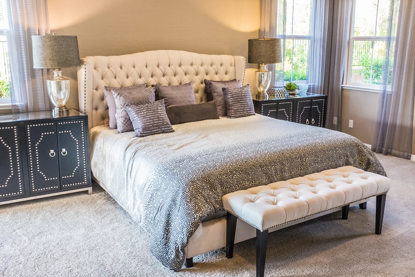
How to choose wall art by starting with the room
Before falling for a particular print, look at the room as a whole. Consider its purpose, the natural light, the furniture and the mood you want to spend time in. Art does not need to match every cushion or accessory, but it should feel connected to the space.
A relaxed bedroom often suits artwork with gentle movement, muted tones or an understated palette. In a living room, you may want something with more presence - a bold canvas print, expressive abstract artwork or a striking photographic piece above the sofa. Entryways work beautifully with art that creates an immediate point of view, especially if the space is small and otherwise simple.
Think about the atmosphere, not just the colour scheme. Black-and-white art can look crisp and architectural in a modern interior, while warm ochres, rusts and earthy neutrals can soften a room with timber, cream upholstery or natural textures. If your furniture is pared back, art is often the best place to introduce personality. If the room already has patterned rugs, colourful textiles or statement lighting, a quieter piece may give it room to breathe.
Get the scale right before choosing the style
Scale is the detail that separates a wall that feels intentionally styled from one that feels slightly accidental. A small print on a large wall can look lost, however beautiful the image may be. Equally, an oversized piece in a narrow gap can make the room feel crowded.
Above a sofa, bed or console, aim for artwork that is roughly two-thirds to three-quarters of the furniture width. It does not have to be exact, but this proportion gives the arrangement visual balance. A single large canvas is often the simplest answer above a wide sofa, particularly in an open-plan room where the art needs to hold its own from a distance.
For a smaller wall, one carefully chosen medium-sized piece can be more effective than trying to fill every inch. Leave some clear wall around it. That negative space helps the artwork feel considered and gives the room a calmer, more elevated finish.
Height matters just as much. As a useful starting point, hang the centre of a piece at around eye level. When art sits above furniture, leave a visible but connected gap rather than placing it too high. Artwork floating far above a sofa or headboard can make the whole arrangement feel disconnected.
Choose a colour story, not a perfect match
The easiest way to make modern wall art look at home is to repeat a colour already present in the room. This might be the green in a plant, the charcoal in a rug, the warm brown of a wooden table or a small accent colour from a cushion. The artwork does not need to replicate that shade exactly. A related tone is often more interesting than a perfect match.
A useful approach is to let your art perform one of three roles. It can blend in by echoing the room's existing palette. It can bridge the space by bringing together colours that already appear separately, such as blue seating and terracotta accessories. Or it can contrast, introducing a deliberate pop of colour into an otherwise neutral setting.
Contrast is especially effective in rooms that feel a little too safe. A vivid red detail within an abstract print can wake up a beige living room without requiring a new sofa. Deep blue artwork can add depth to pale walls. The key is repetition: pick up that new colour once or twice elsewhere, perhaps in a vase, book cover or throw, so it feels purposeful rather than random.
Decide between one statement piece and a gallery wall
There is no universal winner here. A single statement piece feels clean, contemporary and confident. It is ideal for large blank walls, above key furniture or in rooms where you want the artwork to become the main visual focus. Large-scale canvas prints are particularly effective when you want impact without making a space feel busy.
A gallery wall creates a more collected, personal effect. It works well along stairways, in hallways, above a desk or on a wall that needs movement rather than one central focal point. Mix artwork with a shared thread: a similar colour palette, related subject matter, matching frames or a consistent level of contrast. Without one unifying element, a gallery wall can quickly feel like a collection of leftovers.
Lay out the arrangement on the floor first, or use paper templates on the wall to test the spacing. Keep gaps between frames relatively consistent. The art does not need to be symmetrical, but the overall shape should feel balanced.
Select the finish that suits your home
The format of your wall art affects the mood as much as the image itself. Canvas prints have a substantial, gallery-inspired presence and work especially well for abstract art, large-scale colour and pieces intended to anchor a room. Their softer, frameless finish can suit contemporary living spaces and bedrooms where you want warmth without visual clutter.
Posters offer a lighter, more flexible route. They are ideal for renters, first homes, offices and smaller walls, and they make it easy to refresh your look when your style evolves. A framed poster can look polished and structured, while an unframed format can feel more relaxed depending on the room.
Decorative wall pieces introduce texture and dimension, which can be valuable in spaces filled with smooth surfaces. If your room has flat-painted walls, streamlined furniture and minimal pattern, consider art with visible brushwork, layered forms or tactile materials. Texture adds interest even when the palette is quiet.
Use art to solve awkward walls
Wall art is one of the quickest ways to make difficult areas feel designed rather than ignored. A narrow wall beside a doorway may suit a vertical print. A long corridor can take a series of related posters. Above a console table, a piece that echoes the table's width creates a satisfying, finished composition.
In rental spaces, art is also a practical way to shift the character of a room without changing permanent fixtures. If the paint colour, flooring or kitchen cabinetry is not your first choice, select artwork that introduces a palette you genuinely enjoy. The eye will naturally be drawn towards the art, making the space feel more like your own.
Do not feel obliged to fill every blank wall. A room needs resting space as well as focal points. Choose the walls that matter most when you enter, sit down or move through the home, then give those areas the attention they deserve.
Let your taste lead the final choice
Trends can offer useful direction, but the best wall art is artwork you will still want to look at after the room is finished. Choose images, shapes and colours that create a reaction, whether that is calm, curiosity, warmth or a little drama. A well-styled home should feel curated, not copied.
If you are deciding between two pieces, picture each one at the end of an ordinary day: lamps on, furniture in place and the room being lived in. The right choice is often the one that makes the space feel more complete without asking for attention every second. That is the quiet power of art chosen well.